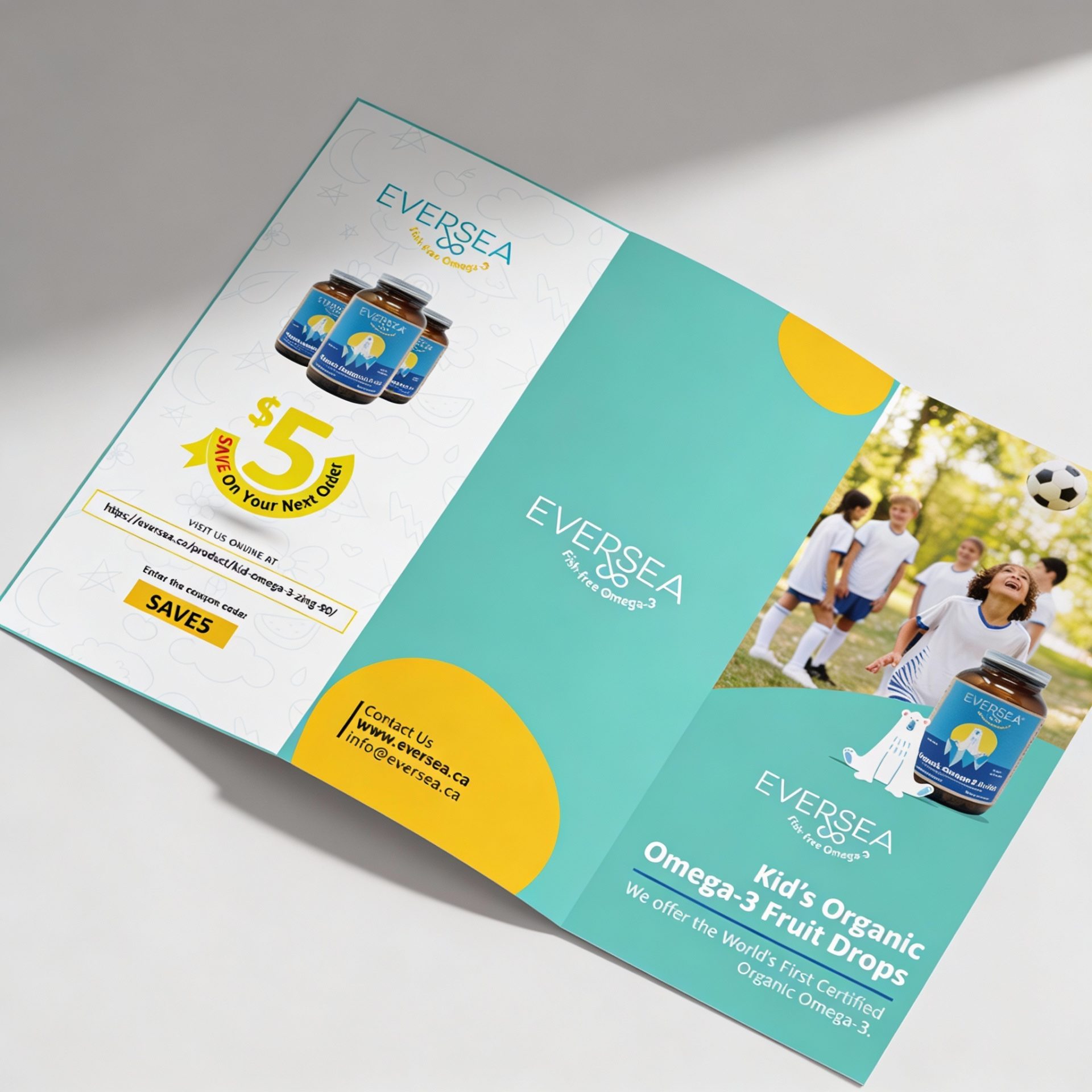
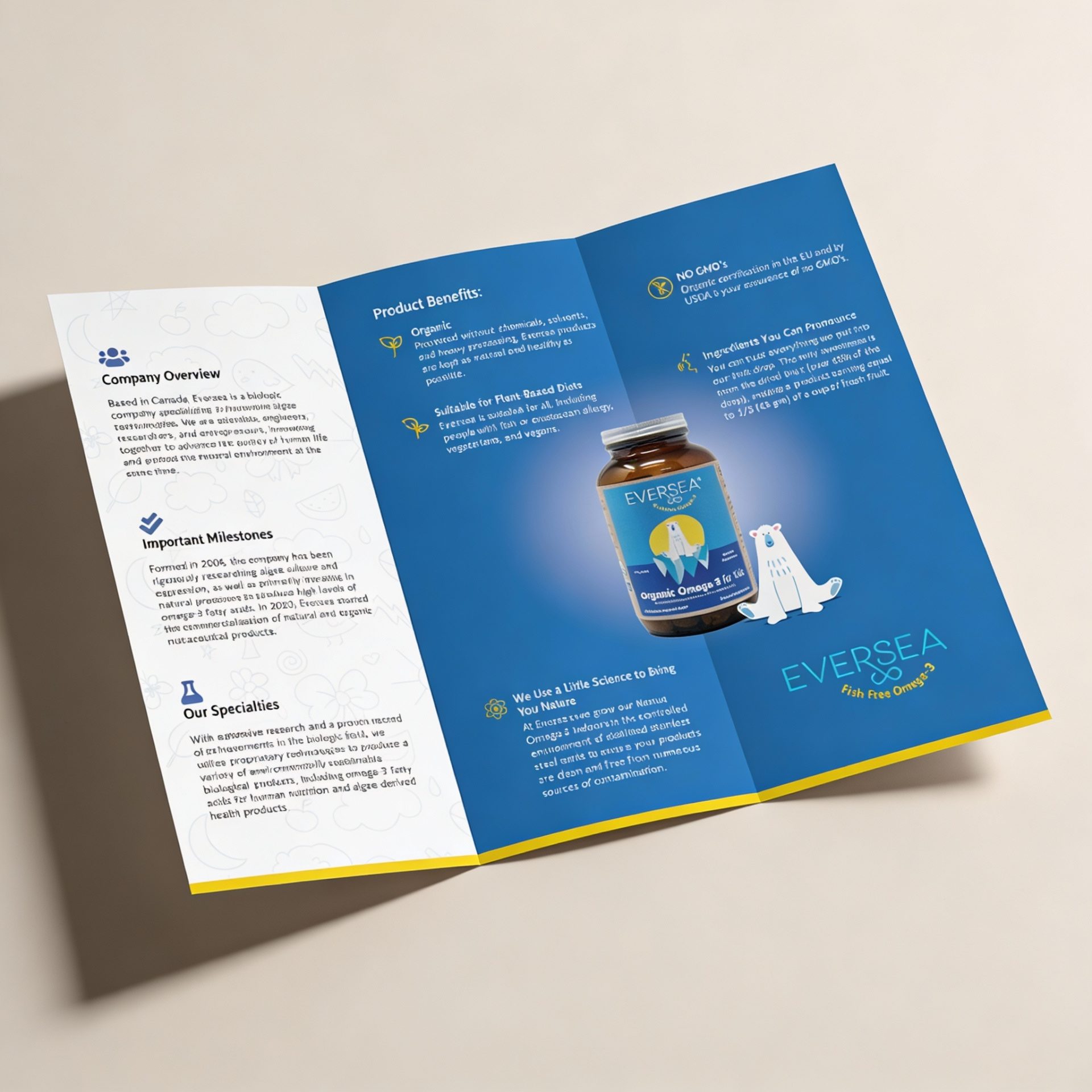
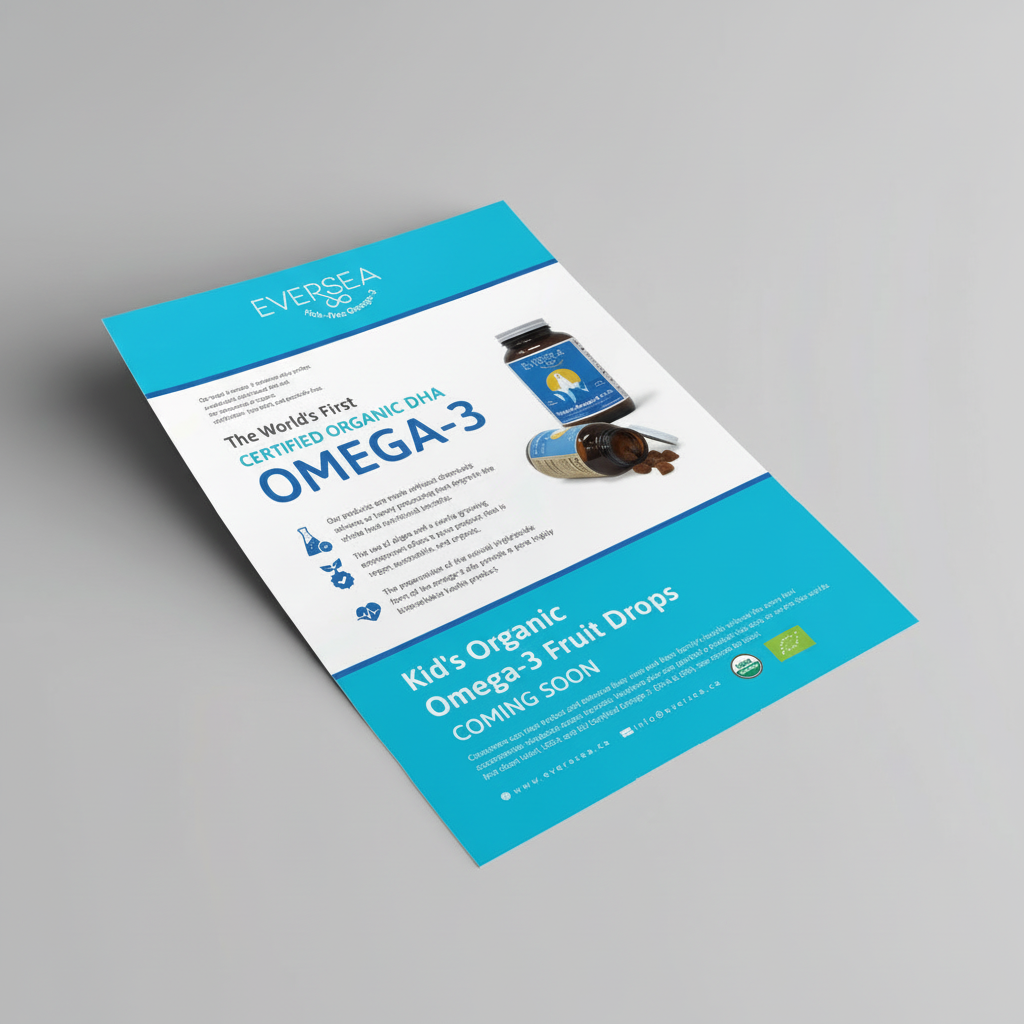
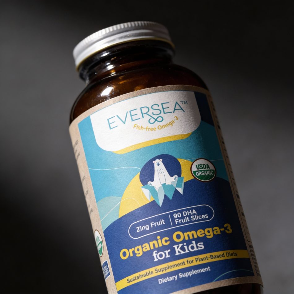
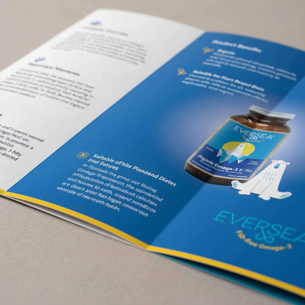
Beyond the label itself, these materials demonstrate how the EVERSEA visual identity scales across long-form and single-page formats. The brochure allows space for storytelling, education, and credibility-building, while the sell sheet distills that information into a concise, high-impact overview suitable for sales meetings and trade environments.
Together, these pieces reinforce brand consistency while serving different communication needs—showcasing how thoughtful design can support both marketing and sales objectives. The final execution feels cohesive, professional, and adaptable across digital and print applications.